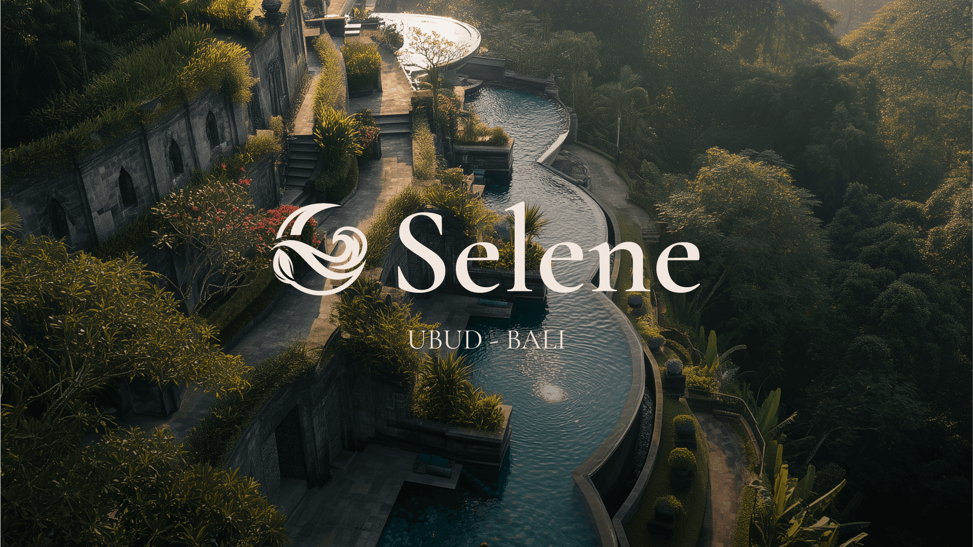
A conceptual luxury resort identity rooted in the pull of water and the lush hills of Ubud, Bali. Selene is a private retreat designed for the well-traveled guest seeking a place that finally feels like it was made just for her.
Scope
Sector
Duration
Year
/
The Concept
(01)
Some places you visit. Selene is a place you return to.
Luxury hospitality has become a performance of excess; Selene is the antidote. Named for the Greek goddess of the moon, tides, and cycles, the brand is built on a single truth: genuine luxury doesn't announce itself. It holds you. It creates an undeniable pull to return.


/
The Identity
(02)
One form. Three forces.
The central mark unifies the crescent moon, water, and jungle into a single, continuous, organic form. The typographic system is deliberately dual-purpose:
Cormorant Garamond: Carries the elegant, editorial brand voice.
Josefin Sans: Provides modern, operational clarity for wayfinding and signage.
The color palette is pulled directly from the Balinese landscape at dusk: deep ocean teal, forest green, warm linen, and aged gold.


/
The Experience
(03)
A brand that exists before you arrive and stays after you leave.
Every physical touchpoint is designed to feel inevitable. From an ivory robe with a deep teal lining to wayfinding pillars that look grown rather than built, nothing demands attention. The art direction mirrors this quiet confidence, using film grain, natural light, and unposed subjects to capture a world that feels like a nostalgic memory of a place you already know.


Continue Exploring.
Further selections from the studio archive

